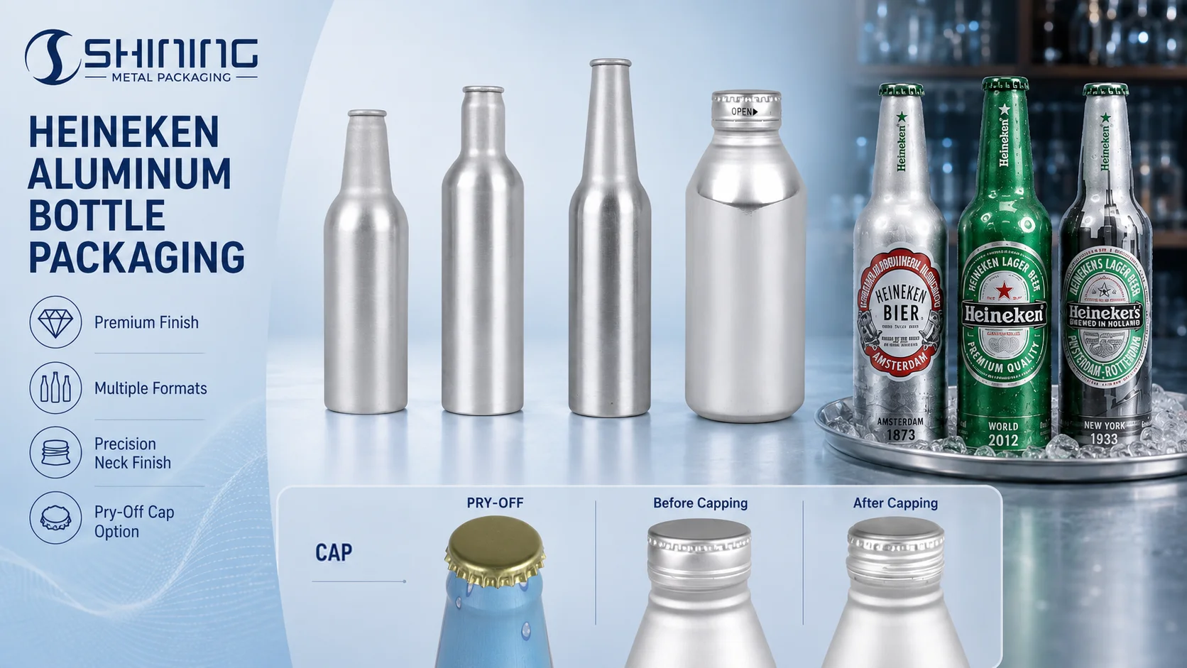
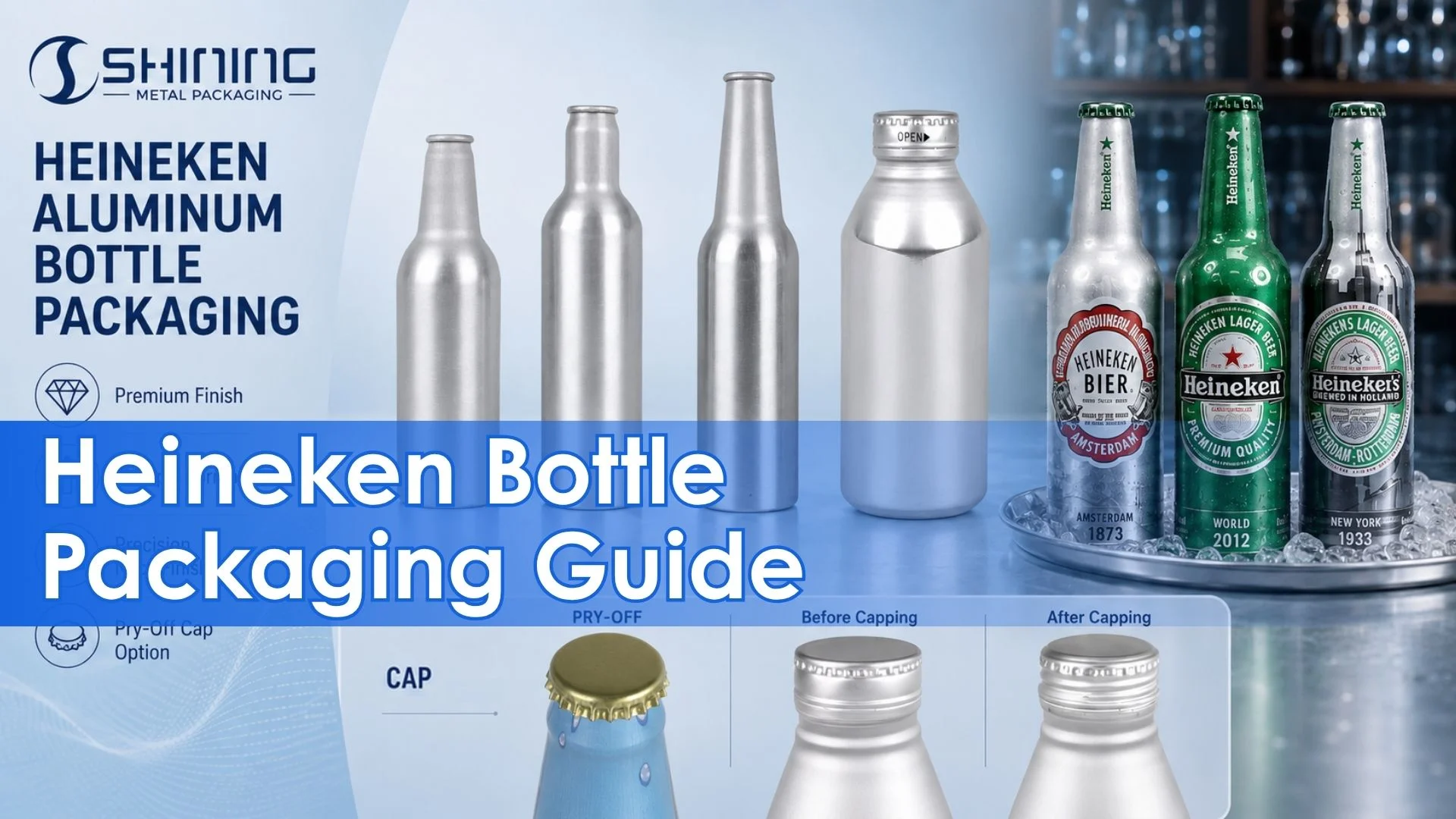
The useful question is not whether aluminum can replace Heineken’s green glass bottle. It is where a bottle-shaped metal package can preserve the brand’s drinking ritual while solving a specific venue, handling or presentation problem.
1. When an iconic green bottle cannot go everywhere
“That green bottle, the red star, the smiling ‘e’… like an instant welcome from an old friend.”
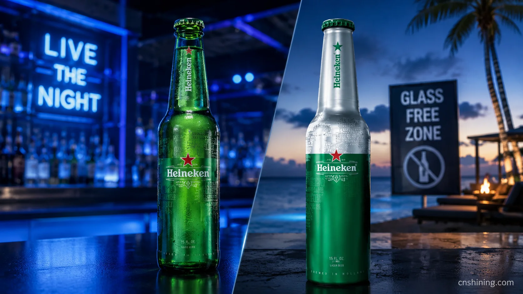
That description explains the central tension behind the Heineken garrafa de alumínio. Heineken Original is a 5% ABV lager whose recognition has been built around a transparent green bottle, yet some of the brand’s most relevant social occasions are precisely the places where glass is inconvenient or prohibited. Aluminum therefore works best as an extension of the bottle ritual, not as a universal substitute for glass.
The brand has already tested that logic over a long period. Its first Paco aluminum bottle was introduced in 2002 for Paris nightlife, then tested at beach bars where glass had been banned. Later versions moved through exclusive clubs, black-light environments and city-specific editions for rooftops, patios and pool areas. These were not neutral material changes: each aluminum bottle was attached to an occasion with a clear reason to depart from the standard green glass package.
This history gives Heineken an unusual advantage. It does not need to invent a new aluminum-packaging story from scratch. It needs to decide which recognizable elements survive the material change: the green field, red star, smiling “e,” bottle-like drinking posture and association with international nightlife. Metallic reflection, special varnish or interactive ink can add a new layer, but they should not replace those recognition cues.
2. Why the Heineken aluminum bottle works as a selective format
A current U.S. retail listing still shows Heineken lager in an eight-pack of 16 fl oz aluminum bottles. The 473 mL size is significant: it creates a visibly substantial bottle for bars, events and outdoor occasions, while remaining familiar to U.S. consumers who already encounter domestic lagers in the same format.
The format’s strongest argument is not a generic list of aluminum benefits. It is the combination of a bottle-shaped drinking experience, non-breakable body, opaque light barrier and potential resealability. For Heineken, these functions answer a specific contradiction: the package must feel more deliberate than a conventional can but remain practical on dance floors, pool decks, beaches, stadium concourses and temporary event sites.
| Structural variable | Role in the Heineken concept | What must be validated |
|---|---|---|
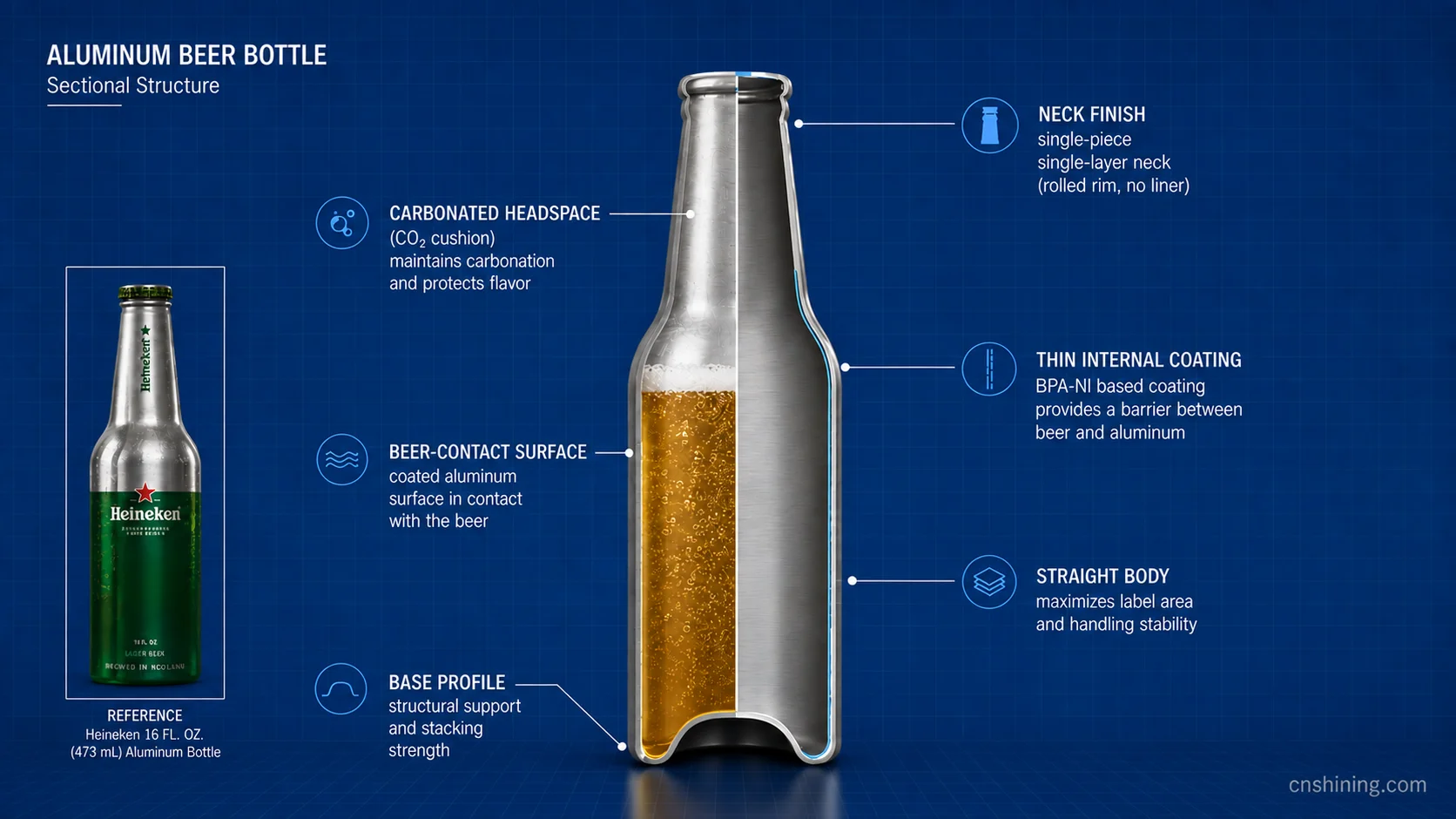
| Bottle body and shoulder | A bottle-like silhouette supports direct drinking and distinguishes the format from a standard beer can. | Stable conveyance, adequate sidewall strength, controlled denting and enough straight-wall area for brand and legal information. |
| Revestimento interno | Separates the lager from bare aluminum and protects taste, appearance and container integrity. | Compatibility with measured beer chemistry, alcohol level, storage period, filling process and thermal exposure. |
| Neck finish and closure | Determines tamper evidence, opening torque, carbonation retention and whether short-term resealing is credible. | Boné and liner match, venting behavior, leak resistance, opening consistency and compatibility with the intended capping line. |
| Pressure and headspace control | Maintains the intended carbonated lager experience throughout distribution and consumption. | CO₂ retention, dissolved and package oxygen targets, closure security, temperature cycling and transport vibration. |
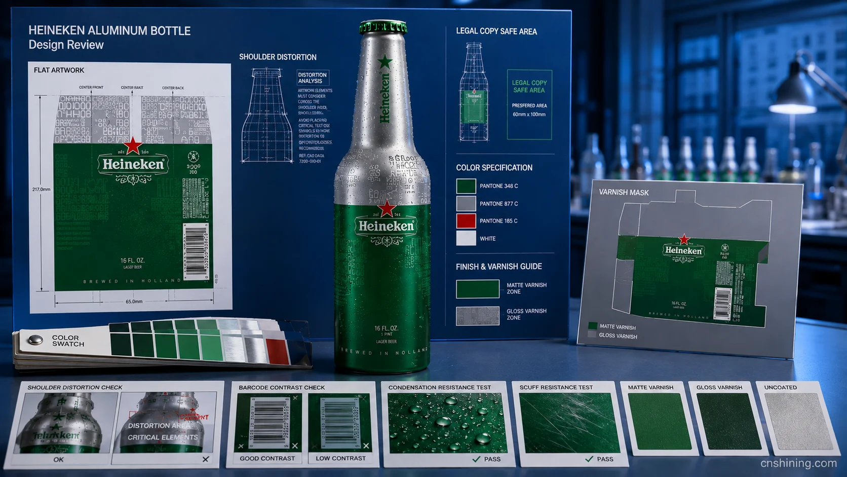
| Decoration and varnish | Translates Heineken’s green-and-red identity onto an opaque metallic surface without making the bottle look like a generic promotional container. | Color consistency, shoulder distortion, barcode legibility, varnish scuff resistance and condensation exposure. |
3. From recognizable graphics to beer-contact performance
Aluminum is not the direct flavor barrier. The internal coating is. Development should therefore begin with measured pH, alcohol content, carbonation, dissolved oxygen targets, total package oxygen limits, filling temperature, pasteurization exposure and intended shelf life. The coating must remain continuous through forming and distribution, while the closure liner must preserve pressure without introducing sensory change.
The decoration strategy has a different task. Heineken’s signature green cannot behave exactly as it does on transparent glass, because an opaque metal wall removes depth and transmitted light. A more coherent translation would combine a controlled dark-green base with the red star, clean white typography and selected exposed-metal or gloss areas. Matte-versus-gloss contrast can help the bottle register in dim venues, while UV-responsive or city-specific graphics remain appropriate for limited programs rather than every permanent SKU. The artwork should be tested on the actual bottle curvature because shoulders can deform symbols, small type and circular graphics.
Legal copy also constrains the bottle geometry. In the United States, TTB mandatory malt-beverage information includes elements such as brand name, class or type, net contents and the responsible company’s name and address. A pronounced shoulder may improve the bottle silhouette but reduce the straight printable panel needed for this information.
For European programs, the package and coating must also satisfy the general safety and inertness principles for EU food-contact materials. In addition, the Packaging and Packaging Waste Regulation generally applies from 12 August 2026, making recyclability documentation, component choices and market-specific disposal information part of the development brief rather than a late-stage label exercise.
4. Aluminum bottle competitors: the 16 oz format is not inherently premium
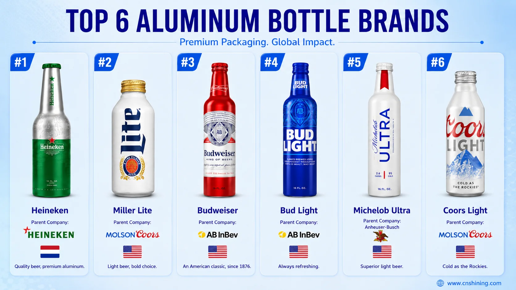
The U.S. market provides a useful controlled comparison because several lager brands use the same 16 fl oz aluminum bottle capacity. Displayed prices below are converted to a single-bottle value from public retail listings; local tax, deposits, promotions and availability can change the actual transaction price.
| Marca | País | Empresa controladora | Capacidade | Retail price per bottle | Core selling point |
|---|---|---|---|---|---|
| Heineken Aluminum Bottle | Holanda | Heineken N.V. | 16 fl oz / 473 mL | US$2.75 | Imported premium lager presented as a bottle-shaped, scene-specific alternative to glass. |
| Miller Lite Aluminum Bottles | Estados Unidos | Molson Coors Beverage Company | 16 fl oz / 473 mL | US$1.67 | Original-light-beer positioning with accessible pricing and practical social portability. |
| Coors Light Aluminum Bottles | Estados Unidos | Molson Coors Beverage Company | 16 fl oz / 473 mL | US$1.67 | Cold-refreshment language linked to tailgates, barbecues, camping and group occasions. |
| Budweiser Aluminum Bottles | Estados Unidos | Anheuser-Busch InBev | 16 fl oz / 473 mL | US$1.50 | Classic American lager identity built around gatherings, celebrations and game-day occasions. |
| Bud Light Aluminum Bottles | Estados Unidos | Anheuser-Busch InBev | 16 fl oz / 473 mL | US$1.25 | Casual outdoor consumption associated with beaches, sports viewing and backyard events. |
| Michelob Ultra Aluminum Bottles | Estados Unidos | Anheuser-Busch InBev | 16 fl oz / 473 mL | US$1.36 | Active-lifestyle and sports positioning, including event-specific aluminum-bottle graphics. |
The comparison shows why the Heineken aluminum bottle cannot depend on material or capacity alone. Every brand in the table can offer a non-glass 16 oz package, and several do so at a substantially lower unit price. Domestic brands commonly frame the bottle around broad outdoor and sports occasions; Michelob Ultra has also shown how event artwork can turn the package into a temporary fan object.
Heineken occupies a narrower but more defensible position. Its imported identity, green-and-red recognition system and documented nightlife history allow aluminum to function as an elevated on-premise or limited-edition format. The trade-off is that execution must remain selective. Once the bottle becomes an everyday value pack with ordinary graphics, its higher price risks looking like package cost rather than brand meaning.
5. Conclusion: use aluminum to extend the occasion, not erase the icon
Heineken’s strongest aluminum strategy is a disciplined two-format architecture. Green glass remains the clearest expression of the established brand memory, while the aluminum bottle serves places where that memory must be carried into a safer, more portable and more event-responsive container. The role is especially coherent in nightlife, pools, beaches, stadiums, music events, city editions and collectible programs.
The development priority should therefore be sequence rather than spectacle. First define the venue and commercial role. Then confirm the beer’s compatibility and filling requirements, select the neck and closure system, protect a usable regulatory panel, and only after that design the metallic expression of the green bottle identity. A black-light ink, matte varnish or city graphic has value only after coating, pressure retention, opening torque, leak resistance and print durability have been demonstrated.
For projects with this risk profile, Shining Packaging can coordinate bottle geometry, closure matching, liner selection, print trials, and production validation against agreed filling conditions.
The final judgment is not that aluminum is more modern than glass. It is that Heineken has enough visual history and occasion-specific evidence to assign each material a different job. When the aluminum bottle is treated as a channel instrument rather than a universal replacement, the package adds an occasion to the brand instead of asking consumers to forget the bottle they already recognize.