
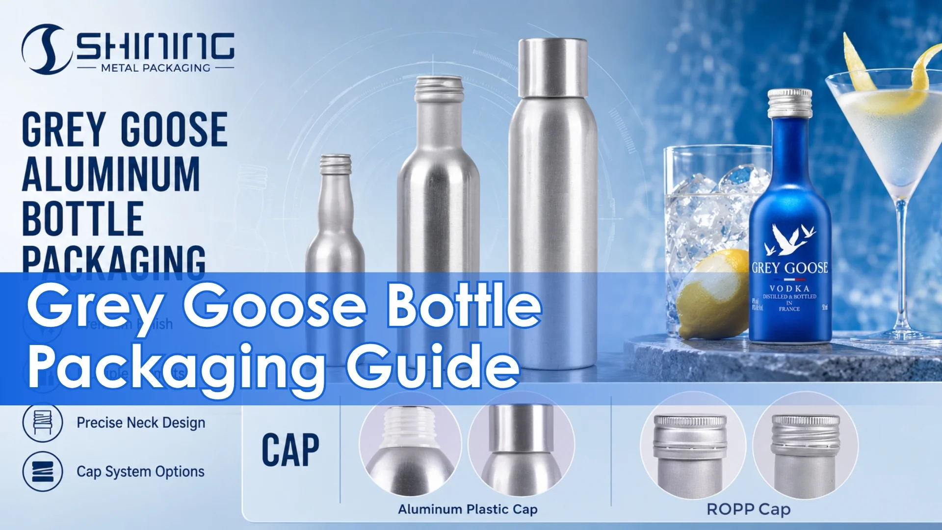
1. Why the Grey Goose Aluminum Bottle Works Best at the Edge of the Portfolio
Grey Goose says founder Sidney Frank set out to create a luxury vodka “made without compromise.” That ambition has always depended on more than the liquid: the brand’s French winter wheat, spring water, single distillation and cold, restrained presentation work as one system. The Grey Goose aluminum bottle therefore succeeds only when it preserves that system rather than treating metal as an isolated sustainability or novelty claim. Grey Goose’s account of the brand’s founding principle connects the original premium proposition to production discipline, while its product information confirms a 40% ABV vodka made from French wheat and spring water.
The central packaging tension is unusually clear. Grey Goose’s full-size identity is tied to a tall frosted bottle, blue-and-white graphics, flying-geese imagery and the visibility of a luxury spirit vessel. The brand has even retained glass while redesigning the base to reduce bottle weight by approximately one fifth. A complete 750mL conversion to metal would consequently replace an existing brand asset, not merely substitute one container material for another. The brand’s description of its lighter glass bottle supports a more incremental interpretation of material change.
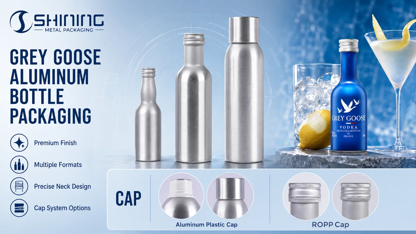
The existing 50mL metallic-blue miniature shows the more credible role for aluminum. A current U.S. retail listing identifies it as a single 50mL aluminum bottle priced at approximately $3.49, while the brand’s official size range already treats 50mL as an established format. In that scale, aluminum does not ask the shopper to reconsider what the flagship bottle should be. It answers a different question: how can the vodka enter minibar, gifting, tasting and portable occasions in a container that is compact and resistant to breakage?
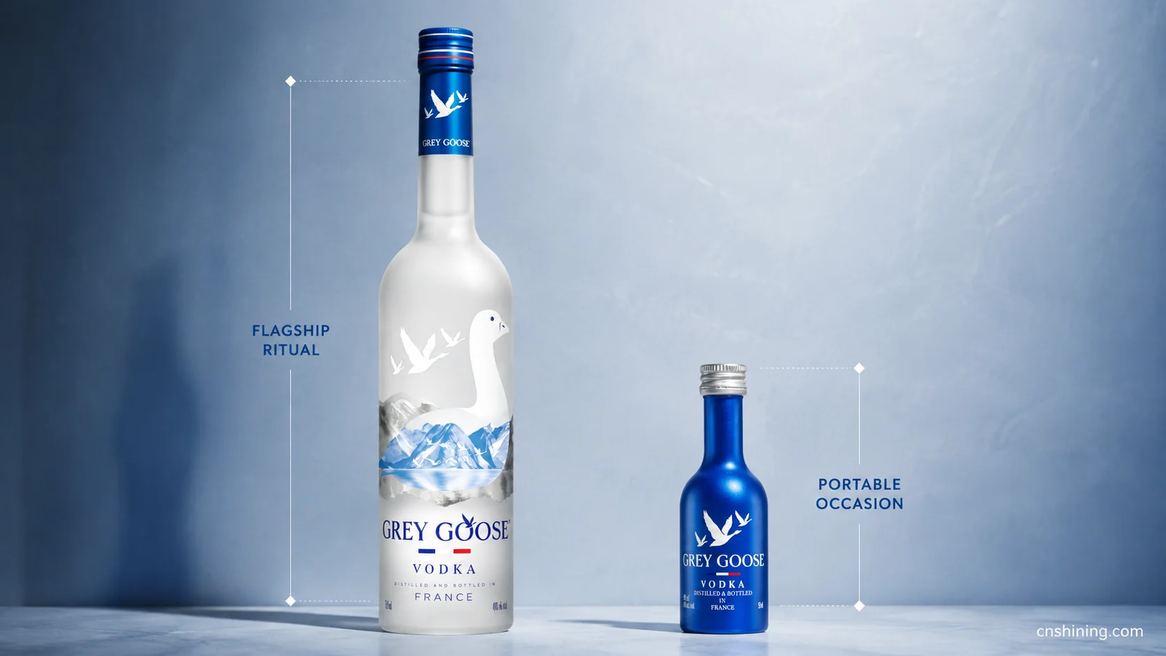
2. Translating Frosted-Glass Recognition into Aluminum Bottle Engineering
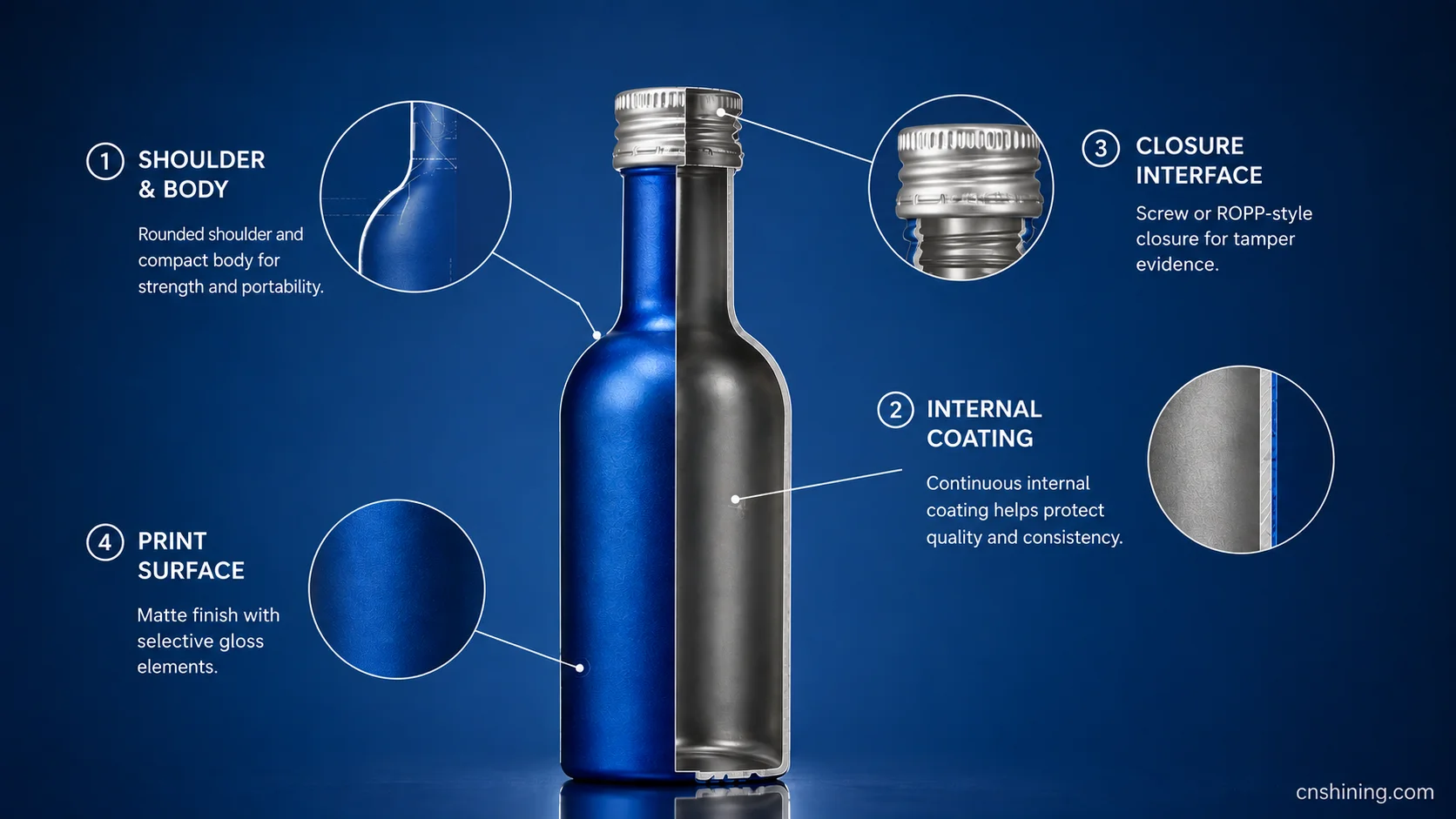
The strongest development brief is not “make a premium metal bottle.” It is “translate Grey Goose’s cold, vertical and French visual language into a format that still behaves like a spirits bottle.” A narrow cylindrical body, a deliberate shoulder transition and a compact neck can retain the posture of the glass pack. An overly wide body, exposed can-style seams or beverage-can graphics would move the product toward energy drinks and mass-market RTDs, weakening the reason for paying a miniature premium.
Surface treatment should perform the work that frosting and layered glass decoration currently perform. An ice-white or cool silver ground can carry low-saturation blues, sharply controlled flying-geese artwork and selective gloss against matte areas. The engineering issue is not simply whether a design can be printed. It is whether color remains stable through forming and filling, whether varnish resists abrasion in trays or gift packs, and whether dents create visible distortion in the most important brand graphics.
| Decision area | Grey Goose requirement | Development implication | Validation priority |
|---|---|---|---|
| Bottle geometry | Retain a tall, clean and controlled silhouette rather than a can-like profile. | Use a cylindrical body with a restrained shoulder and sufficient panel stability for small-format handling. | Dimensional consistency, top-load behavior, grip, controlled pouring and dent visibility. |
| Internal coating | Protect a 40% ABV ethanol-water system without sensory change. | Select the coating against the final formula, fill process, shelf life and storage temperature rather than against “vodka” as a general category. | Migration, corrosion, coating absorption, aroma, taste and accelerated storage. |
| Neck and closure | Provide tamper evidence and a familiar spirits-opening action. | A screw or roll-on closure should be developed as a matched neck, cap, liner and application-torque system. | First-open torque, tamper-band separation, leakage, removal torque retention and pour control. |
| Decoration | Recreate frost, depth and blue-white recognition without imitating a mass-market can. | Combine a matte base with controlled gloss, durable blue reproduction and limited tactile detail. | Color tolerance, print registration, varnish cure, rub resistance and scuffing after transport. |
| Consumer handling | Feel compact and deliberate rather than thin or disposable. | Balance low weight with wall strength, stable grip and a base that does not rock after minor impacts. | Drop tests, panel deformation, hand feel, residual drips and pack-to-pack abrasion. |
The internal coating and sealing interface are the highest-risk decisions because they protect both product integrity and brand trust. U.S. food-contact rules allow resinous and polymeric coatings to serve as continuous functional barriers over metal, but regulatory eligibility does not replace formula-specific performance testing. A coating that works for unflavored 40% ABV vodka should not automatically be carried into citrus vodka, fruit expressions or a vermouth-and-bitters martini blend. 21 CFR 175.300 on resinous and polymeric food-contact coatings.
3. From the 50mL Drinking Action to Label Space, Leakage and Channel Fit
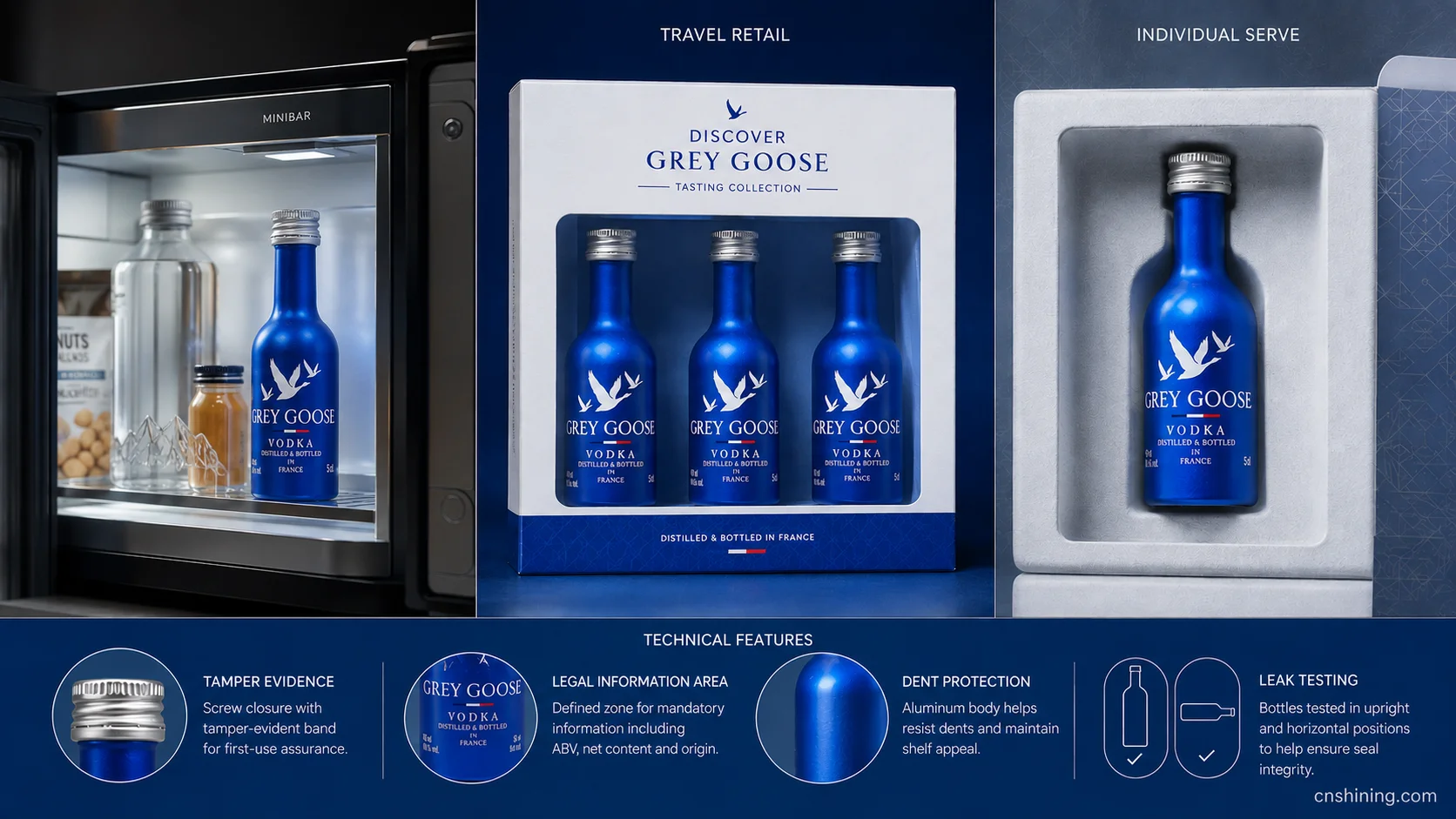
A 50mL bottle is normally opened once, poured quickly and discarded or recycled. Its critical moments are therefore tamper-band break, cap removal, controlled flow and the absence of sharp edges or residual drips. A proposed 200–250mL extension would create a different package: consumers may open it repeatedly, carry it in a bag, store it horizontally and expect the closure to remain clean and leak-free. The larger format would require more demanding torque-retention, repeated-open and orientation testing even though the product formula remained unchanged.
This distinction also changes the most credible channel story. The miniature is suited to tasting sets, minibars, travel retail and controlled individual serves. A resealable 200–250mL bottle could support hotel rooms, premium transport, outdoor hospitality or venues that limit glass, but only if the bottle does not feel like a refilled sports flask. The package must retain a clear spirits-opening ritual and enough decoration quality to justify a higher price per milliliter.
Small-format labeling can become a harder constraint than forming the bottle. In the United States, TTB requires brand name, class or type and alcohol content to appear in the same field of vision, while health warning, net contents, name and address and country-of-origin information must also be accommodated where applicable. This makes front-panel restraint essential: the primary display should prioritize Grey Goose recognition, “vodka,” ABV and net contents before adding extended campaign copy. TTB mandatory label placement guidance.
European distribution adds another layer. Spirit-drink naming and presentation must align with Regulation (EU) 2019/787, while the complete food-contact system must satisfy the general safety principles governing materials intended to contact food. A multi-market miniature may therefore need a disciplined information hierarchy, multilingual secondary packaging or an electronic information route rather than dense text wrapped around the entire bottle. EU rules for the description and labeling of spirit drinks and the EU framework for food-contact materials should be reviewed together during artwork approval.
The resulting validation plan should follow actual use: upright and horizontal leakage, cap torque after hot and cold cycling, coating compatibility, sensory stability, drop and vibration exposure, print rub, cap-edge safety and dent acceptance. Secondary packaging matters only where it prevents visible bottle damage or closure loading; it should not become a separate packaging story.
4. Competitor Landscape: Five Vodka Brands Already Using Aluminum Bottles
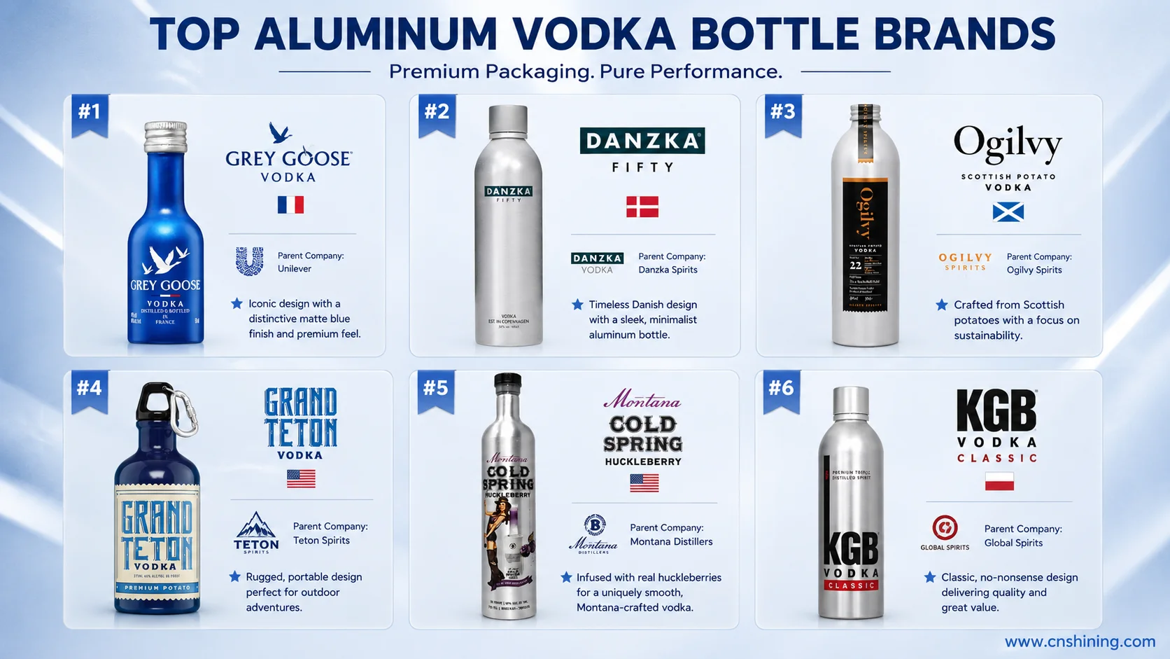
Aluminum remains unusual in full-strength vodka, so the most useful comparison is not a ranking of mainstream glass brands. It is a review of the relatively small group that has made metal part of a finished vodka product. The examples below were selected because the content is vodka and the primary container is identified as an aluminum bottle or flask. Retail prices are single-bottle observations in the currencies of their listed markets and were not converted.
| Brand | Country | Parent company | Capacity | Single-bottle retail price | Core selling point |
|---|---|---|---|---|---|
| Danzka Vodka Fifty | Denmark | Waldemar Behn GmbH | 1L | DKK 155 | A shaker-inspired aluminum bottle used as a permanent Scandinavian design signature and travel-retail format. |
| Ogilvy Scottish Potato Vodka | Scotland, United Kingdom | Ogilvy Spirits Ltd | 500mL | £32.50 | Farm-produced potato vodka using a tall aluminum bottle to support a lighter, reusable and locally rooted packaging narrative. |
| Grand Teton Potato Vodka Flask | United States | Grand Teton Vodka, Inc. | 375mL | $12.99 | An aluminum flask with a carabiner, positioning vodka for outdoor travel and Yellowstone-related retail rather than formal table service. |
| Montana Cold Spring Huckleberry Vodka — Metal | United States | Bozeman Spirits Distillery | 750mL | $40.95 | A river-safe and travel-safe aluminum presentation tied directly to Montana’s outdoor culture and huckleberry flavor identity. |
| KGB Vodka Classic | Mauritius | Grays Inc Ltd | 700mL | MUR 694 | Cane-based vodka using vibrant aluminum as a core brand code, with portability and faster chilling central to its presentation. |
The market separates into three recognizable aluminum strategies. Danzka and KGB make the metal bottle part of the brand’s continuing visual identity. Ogilvy uses aluminum to reinforce a farm-based sustainability and reuse story. Grand Teton and Bozeman treat it as equipment for outdoor movement, where break resistance and carry behavior are more important than formal gifting.
Grey Goose occupies a different position. Its aluminum bottle is smaller, more controlled and deliberately subordinate to an established glass icon. That gives the brand less freedom to make aluminum look rugged or overtly utilitarian, but it also creates a valuable premium miniature space. The closest competitive advantage is not the most recyclable-looking bottle or the fastest-chilling claim. It is the ability to make a 50mL metal pack feel like a precise reduction of a luxury vodka object.
5. A Development Path That Protects the Brand Before It Expands the Format
The next logical step is not a custom 750mL aluminum flagship. It is a disciplined validation program around the existing miniature and, if the channel case is strong enough, a resealable 200–250mL companion. The 50mL format can test decoration durability, cap experience, consumer acceptance and small-format economics with limited risk to the glass-led portfolio. The larger portable bottle can then be justified only where repeated opening, glass restrictions or transport exposure create an observable benefit.
Development should begin with one defined formula and one defined market. Original 40% ABV vodka offers a more controlled starting point than citrus, berry or bottled martini variants, but it still requires a complete product-package test. The gate should include coating compatibility, migration documentation, sensory stability, closure torque, leak resistance, drop and vibration performance, print abrasion and final-label approval. Extending the same package to flavored vodka should be treated as a new compatibility decision rather than an artwork change.
For a project like this, Shining Packaging can coordinate ROPP closure matching, inner-coating compatibility, print surfaces, sampling and scale-up validation around a defined 40% ABV formula.
Conclusion
The Grey Goose aluminum bottle is most persuasive when it solves a specific serving and channel problem without competing with the flagship’s glass ritual. Its future value lies in controlled portability: a technically validated miniature, a possible resealable mid-size extension and selective metal gifting, all governed by formula compatibility, closure performance and disciplined brand translation. In this case, restraint is not a limitation of aluminum packaging; it is the condition that allows the material to feel recognizably Grey Goose.